Ask anyone what they like about their favourite shop and the answer will almost invariably revolve around people, and the experiences they create. A cheery hello, a chat about the weather or a skilful recommendation will go a long way to encouraging a customer to come back again and tell their friends.
There can be no question, though, that it also matters what kind of physical space we create when we build a shop, café, restaurant or any other space that is designed to attract passers-by.
So if we want our commercial spaces to be filled with curious customers, what are some of the stimuli we should be thinking about? What are some of the factors we should have in mind when building a retail or hospitality space?
Here are four thoughts inspired by visits to a great chain store and a great independent store, and which might give us food for thought:
The first look - attracting the passer-by
Long-time Moving Tribes readers will recall a post about the importance of light as a beacon to attract first the eye and then the customer.
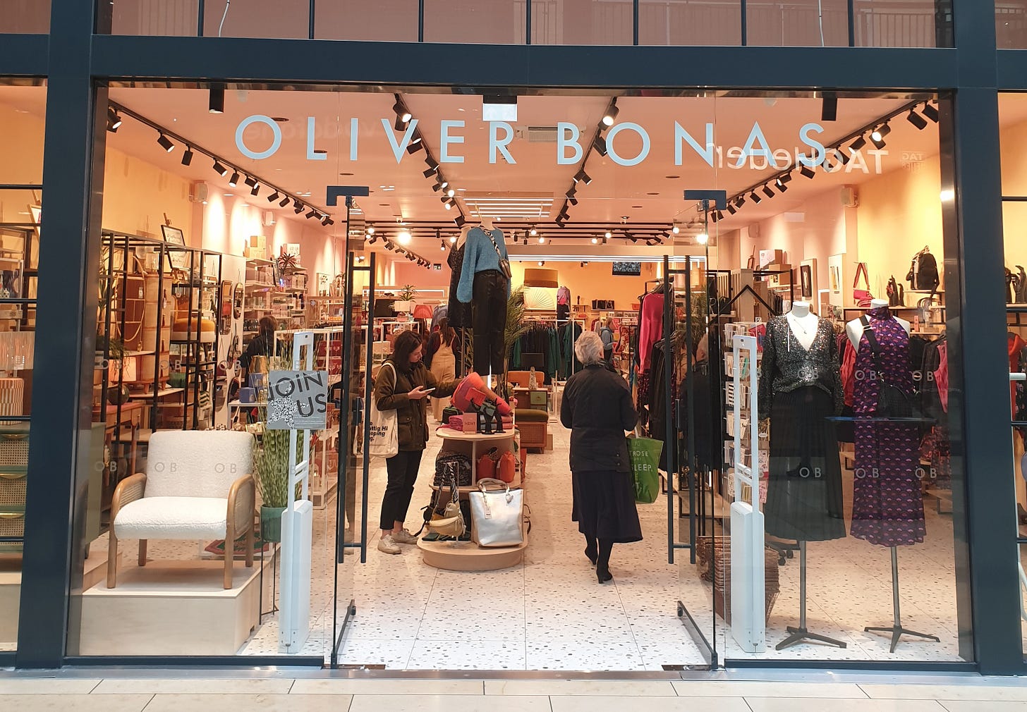
Many small independent shops seem to excel at this use of light as a lure - but for a more ‘chain’ example consider this image from another old post, of an Oliver Bonas store in a relatively humdrum secondary shopping centre in Cambridge, UK:
The attraction of a well lit store are obvious, aren’t they. And yet I’m constantly amazed by how many shops I walk past (chain and independent) which are lit appallingly and look at first glance like they are closed.
The second look - the power of visual merchandising
The importance of visual stimuli in attracting our attention continues, of course, once we are past the door and inside the shop.
Reams have been written about the power of visual merchandising by people who know a lot more about it than I do, and my Twitter (sorry, X) feed is full of pictures of appallingly messy fixtures shared by retail analysts who can’t believe what they are seeing.
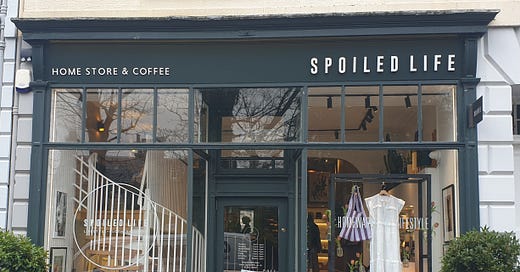
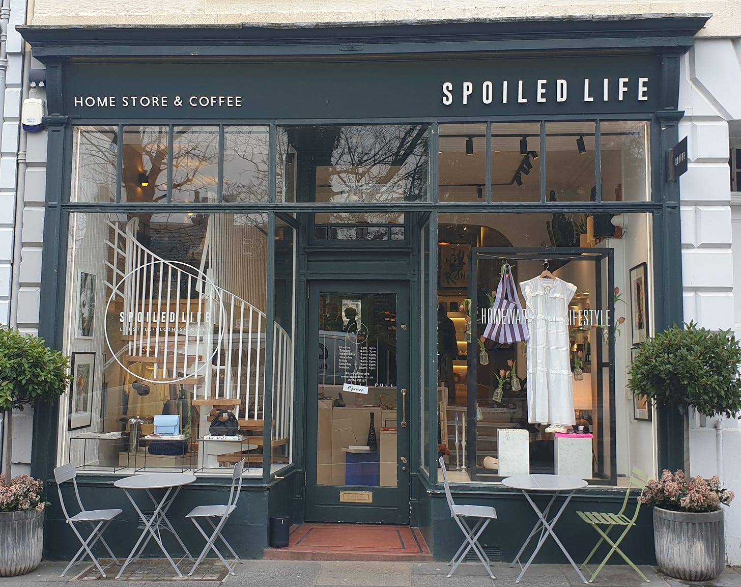
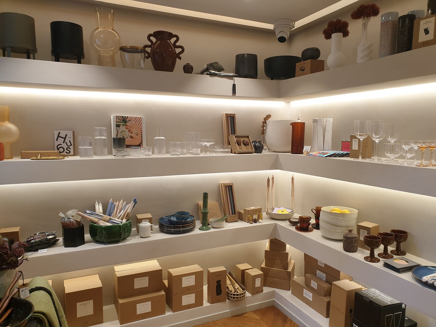
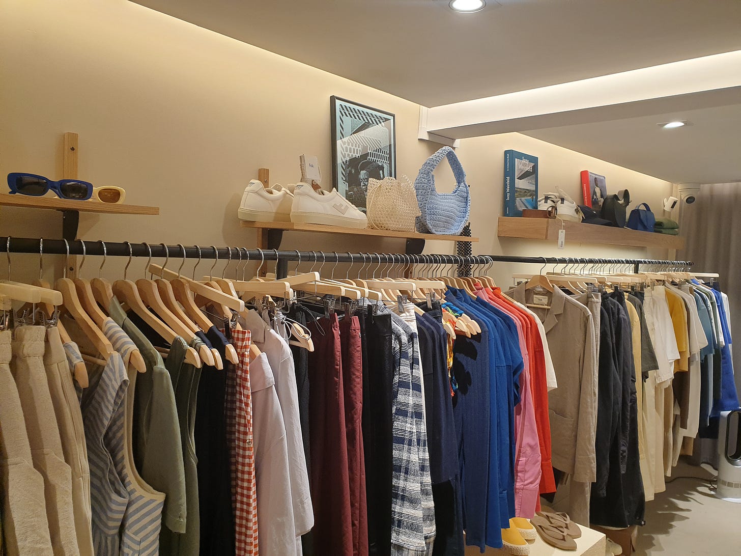
But let’s consider how well it can be done. The theme for this post was inspired by a visit to my daughter Cara’s favourite shop in St Andrews, the lovely Spoiled Life. In a coincidental build from last week’s post, it feels very Japan-inspired both in the design of the store and in the products it sells (though I suspect there is a strong Scandi influence here too), and overall it is a fabulous place to hang out. Here are a couple of bits of the interior look-and-feel:
What strikes even my non-expert eye is the attention to detail which has gone into these displays. Just look at all that lighting - under-shelf, spot and recessed lights all combining to create just the high-value impression the store wants to project (zoom in on the incense shop which illustrated last week’s post and you’ll see the same vision at work).
Products themselves, throughout the store, are laid out in a way designed to maximise their perceived value and to encourage you to explore just a bit more, and it works.
Now the right visual merchandising strategy for every business will be different, of course, but the key thing is for it to be deliberate and designed with your target customer and your own brand-image in mind. That is by no means the exclusive preserve of the high-end boutique. There is a charity shop in a town near me where the team have rigorously organised the donated clothes by colour palette in a way that would be right at home in any branded clothes-store, with the result that their shop is light-years more attractive than the usual ‘donations thrown onto shelves’ charity shop look.
Unlocking the power of the other senses
The team at Spoiled Life are skilled at luring you in other ways than just visually - they have also considered your ears and your nose too.
Having an attractive soundscape for your store or café seems basic but it is harder to get right than it might at first appear. It requires a good understanding of your target customer base and the difference between a store with a decent sound system and one without is marked.
It is in the olfactory department that Spoiled Life uses its assets best, though. They are cheating, because not only do they have a coffee bar in the back producing wonderful smells all day, but they also sell incense, and of course burn it in pretty incense holders that they also sell, throughout the day.
Not so easy when you don’t have those advantages, of course, and no-one wants to be assailed by some terrible artificial perfume when they walk through your door, but making sure that the full sensory experience that you deliver for customers is deliberate, on-brand and attractive seems like a cost-effective way to stand out from the crowd.
Justifying the repeat visit
That coffee bar in Unspoiled, and the life-changing pastries it sells, are a double benefit for the shop - not only does it smell great, it also gives the (largely student) target market a reason to come back and visit regularly. At first it seems an odd strategy - the adjacency of £4 coffees and £90 earrings is an unusual one on our streets but it is common in many countries and works well here.
There are other ways of encouraging frequency of visit, of course. Talk to veterans of the Christmas market stall, for example, and they will tell you that even when your core business is selling products for, say £80-100, it is crucial to have a ‘bread and butter line’ priced much lower - that gives customers a reason to stop and browse, at which point it is down to the stallholders’ skill to upsell them. That’s why stalls selling art and photography, for example, will often have a rack of greetings cards with the same images on them at the front.
The same logic can be applied in a store, but is missed surprisingly often.
Seeing the world as others see us
These 4 observations about great stores, taken together with many others that you will add yourself, add up to a recipe for a space that customers want to enter and dwell in. It isn’t a recipe that can be followed slavishly, of course - the ‘best’ retail space will look and feel different depending on what you are selling and who you are selling it to.
The principles, however, apply widely - a well-lit and attractive frontage, products laid out in a logical and customer-oriented way, attention paid to the whole multi-sensory experience customers have in store, a commercial proposition that encourages revisits and the whole thing fronted by friendly and well informed colleagues.
Sounds obvious, doesn’t it. But take a walk down your local high street and ask yourself how many of those boxes each store is ticking. Then grab a cup of coffee and sit across the street from your own store for a while and really try to see it afresh through your customers’ eyes. It is surprisingly what we miss in the helter-skelter of daily tasks that running a retail business requires.
The secret of how to draw more people into your stores and get them to linger and shop more might be right in front of you.

