Last week the Office for National Statistics published its latest monthly update on UK retail sales. Most of the trade and national press agreed with Retail Gazette whose headline was “Retail sales tumble after April washout”.
The figures were indeed worse than many had hoped with sales volumes (so the amount of goods sold in the month) dropping 2.3% in April over the previous month.
You’d be forgiven for thinking, though, that a 2.3% drop doesn’t sound that significant. Once you start taking into account issues like the timing of Easter (in March this year, in April last year) and the pattern of the weather we’ve been experiencing it becomes easy to explain it all away.
There were two things lurking in the coverage of this report, though, that sparked my curiosity. The first was that tracking sales in this way, measuring April as a growth or decline over the previous month, feels like an odd way of going about things - most retailers would track their performance over the comparative period in the prior year as a way of getting a better benchmark of performance. The ONS’s choice of ‘month over month’ measurement is justified in part by the fact that they ‘seasonally adjust’ their numbers - a mathematical process which ought to take account of things like Easter and Bank Holiday timings but all feels a bit ‘black box’ to me. I got to wondering, then, what the ‘year over year’ figures can tell us.
The second thing I started to worry about was that ‘retail sales’ is a pretty big bucket (the ONS survey tracks some £500 Billion of revenue). As the author of a book called The Average is Always Wrong I’m professionally obligated to feel uncomfortable about great big summary statistics like “all retail sales fell by 2.3%” and instead to want to dig into some of the sector detail underneath to see what is really going on.
This week’s post, then, attempts to deal with both of these issues. Diving into the ONS spreadsheet, I have tried to look for trends in monthly data measured on a year over year basis (so how April 24 compares with April 23) and on as granular a basis as possible. I’ve done so, by the way, covering the period from May 22 to the present because that month was the first in which year-over-year measures began to be sensible again as we lapped the end of Covid lockdowns and all their implications for retailers. Let’s look, then, at the summary figures and then some of the sectors.
The big picture
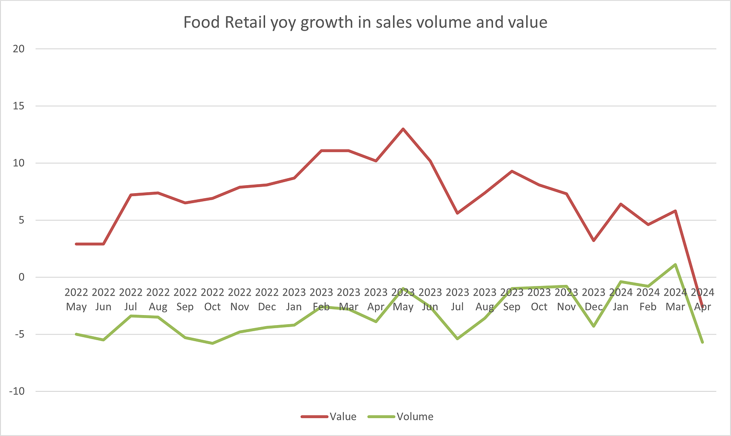
Most summary statistics on retailing have as their first ‘sub-division’ the split into Food and Non-Food. Here’s how Food sales have performed over the last couple of years:
Let’s take a minute to think about what the graph is showing - the red line (or dark one if you are colour-blind) shows the year over year growth or decline in the ‘value’ of retail sales (in other words, the £ note sales reported by retailers). In the last month of the survey it drops into decline but as recently as the month before the Food sector was showing about a 5% growth in spend on the previous year. Given that the previous year it was showing over 10% growth on the year before that, the figures paint a fairly rosy picture of how much consumers are spending with retailers on food.
There is a catch, though. The green line shows a measure of the ‘volume’ of food sales made over the same period. The concept of ‘volume’ of sales is a slightly tricky one. It isn’t literally a measure of the number of biscuits we all bought. Instead it is an attempt to take out the impact of price increases, or inflation, from the value measure. Take February 2024, for example. In that month, we collectively purchased about 5% more food in value terms than we did in February 2023 (the red line). Food price inflation, however, was also running at about 5% and so the ‘volume’ of what we bought was about flat year over year.
What you can see, then, is that the size of the gap between the red and the green lines tells you what inflation was doing in this sector at any given point in time. By looking at the two lines and the gap between them, we can therefore try to work out what the ‘big picture’ conclusion is. In the case of Food retailing, the big picture is that volumes of products purchased have been flat or declining fairly consistently over the last 2 years, and the revenue growth shown by the sector was entirely driven by price inflation. That price inflation has now dropped away as the economy has weakened and higher interest rates have fed through to consumer spending power, with the result that the whole sector has stopped growing, at least in the most recent month.
What, then, of other retail sectors? Let’s look at their graphs and try to pull out the ‘big picture’ from those too:
Total Non-Food
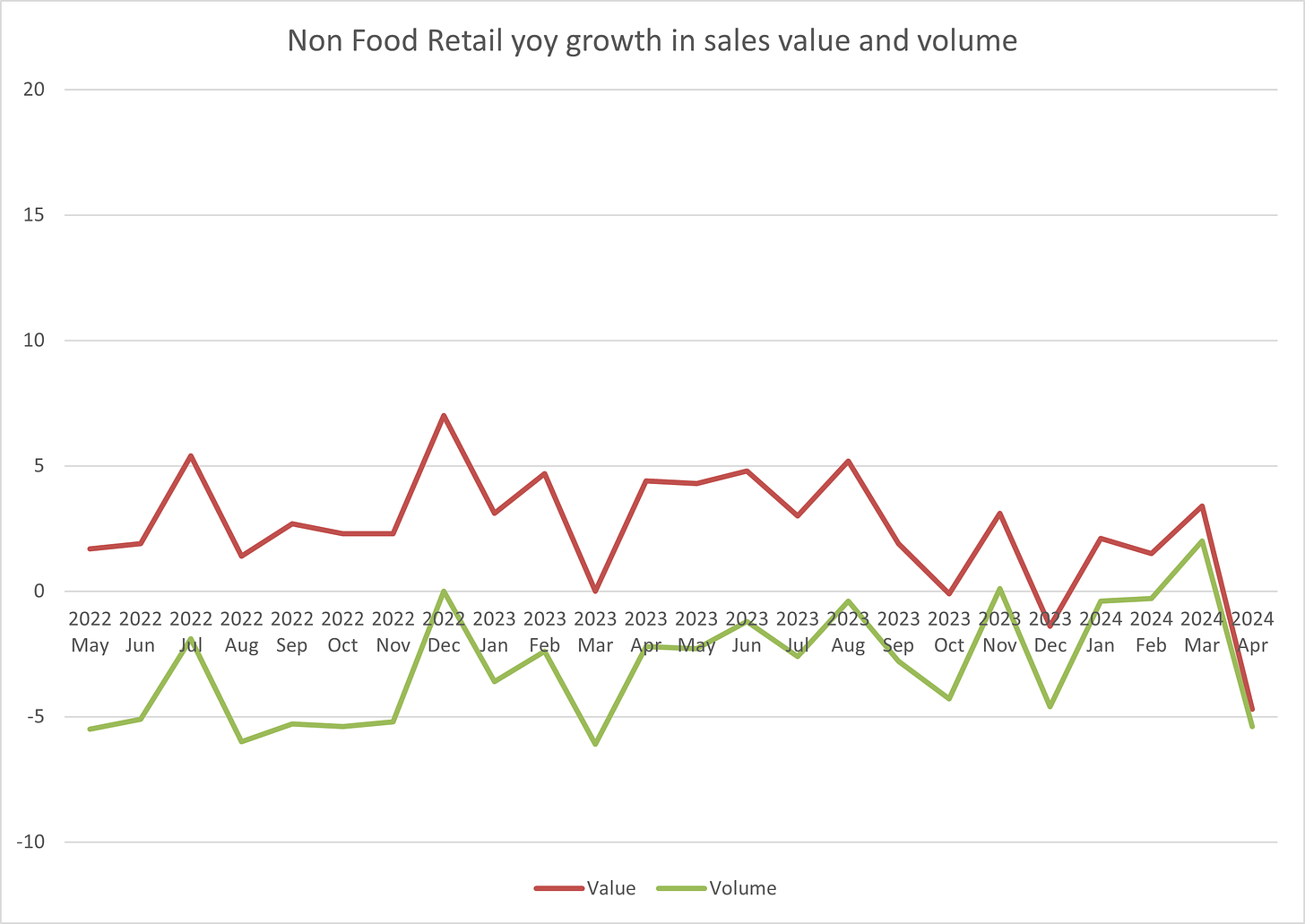
The ‘other half’ of retail sales is ‘non-Food’ (I’ve excluded fuel sales from all of these graphs as it is a very different market). Total non-Food sales have performed like this:
The ‘Big picture’ conclusion - similar to Food, all growth has really come from price inflation, which again has now dropped to virtually zero - the big difference from Food is that the level of inflation was never as high - no double-digit sales growth in this chart. There are some signs that the ‘volume’ of what we have been buying has recovered a little (or at least declined less quickly), even getting into growth in the months before the April washout.
Hold on, though, this is still a great big smush of an average - what about some of the sectors that make up ‘Non-Food’? Let’s take a look:
Clothing
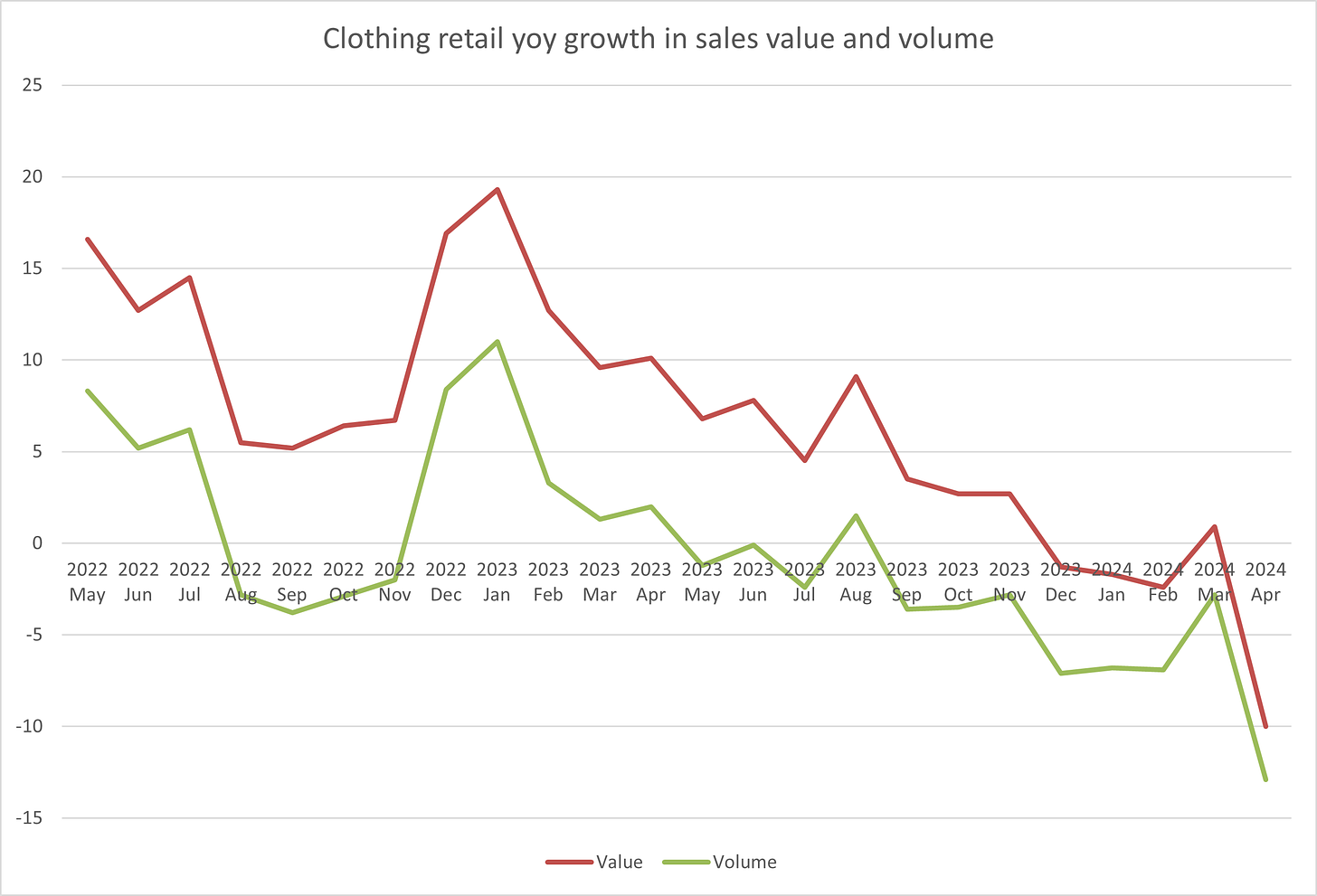
The Clothing sector makes up about a quarter of the Non-Food category, and has performed like this:
We can see in summary that over large parts of 2022 and 2023 the Clothing sector was growing in both value and volume terms - we were refreshing our wardrobes after the lockdown years, I suspect. This year, however, the volume performance has gone negative and as inflation has dropped away and competitive pressures have risen, so has the revenue performance.
This graph shows more than any other the importance of getting into the detail with these big data sets. Whilst the big Food and Non-Food averages meander along, the Clothing sector data shows something much more alarming - a steady drift from growth to decline. That’s worrying because the sector must represent a pretty good litmus test on how we are all feeling. Even though other economic indicators (and measures like GFK’s consumer confidence survey) have shown more positive shifts recently, I can’t help wondering whether this chart reflects a bit more of the reality of higher interest rates gradually impacting the consumer market as people reach their re-mortgage dates.
Furniture & DIY
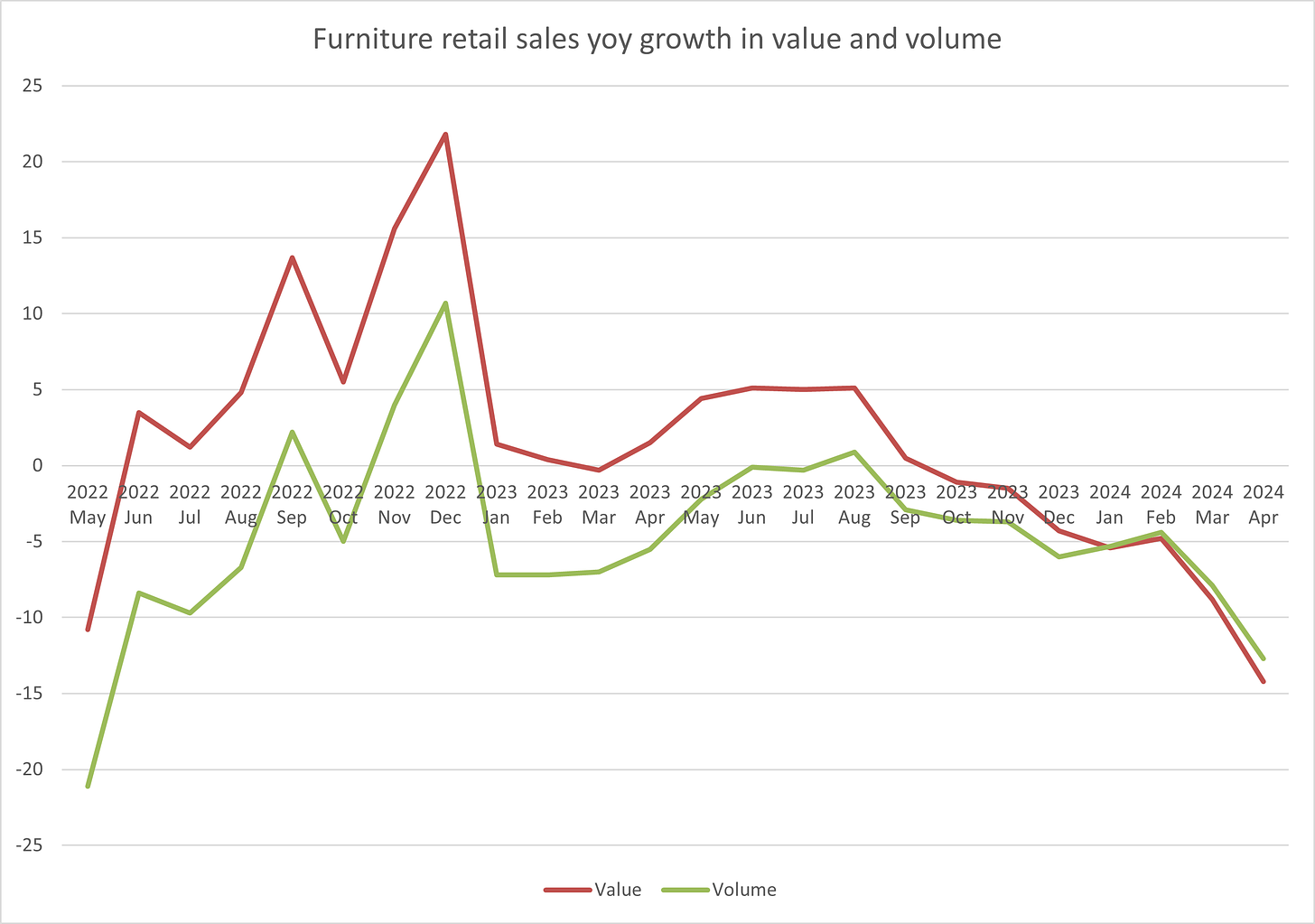
The Furniture sector (which also covers Lighting) has performed like this@
Again a different picture than other sectors - one showing a strong post-pandemic bounce-back as we spread our wings and spruced up our houses, but that performance then drifting negative more recently and a sharper fall in price inflation (in fact into ‘deflation’ where prices are falling year over year) in recent months.
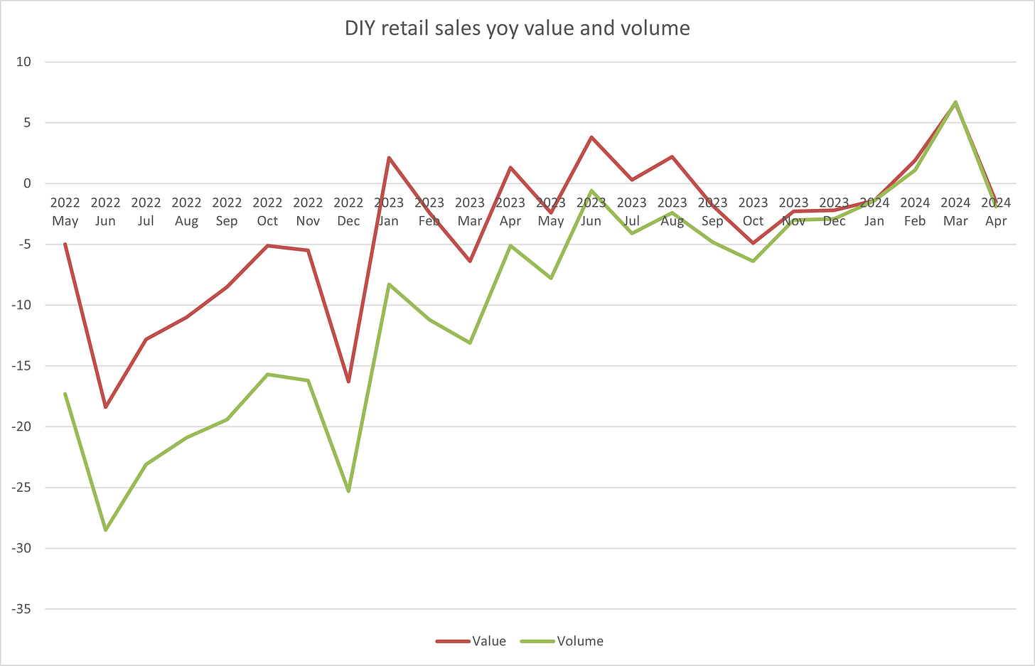
If Furniture is one measure of how we invest in our homes, what about the other - DIY spend (here proxied with the ONS Hardware, Paint and Glass sector):
Here we can see some really sharp monthly movements which I suspect are driven by bank holiday timings (there is no seasonal adjustment in this data), but the bigger picture is that the sector has stayed in negative territory for much of the period we are tracking. The really negative early bit of the graph is explained by the fact that this category had quite a ‘good’ lockdown as ‘essential retailers’ and showed some ‘normalisation’ thereafter. Nonetheless, it is hard to avoid the conclusion that consumers are not yet rushing to spend money on their homes.
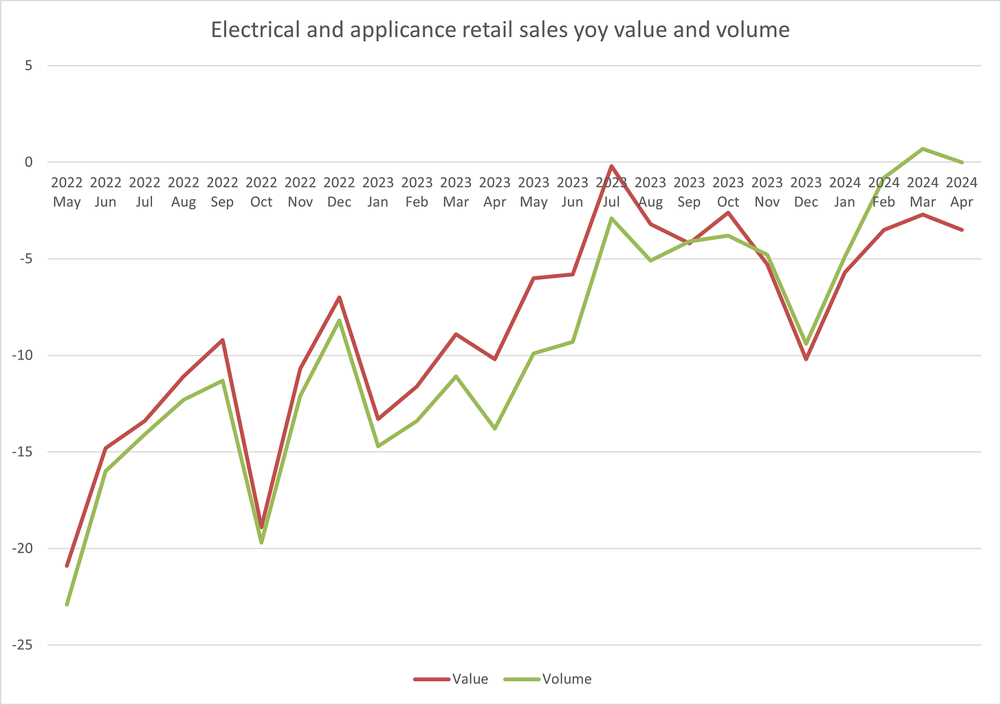
Electricals and appliances
Another oddity is the performance of the Electricals sector which has shifted from a horrid 2023 into a slightly better 2024, Note that the gap between volume and value is much lower in this sector - so intensely competitive that inflation never really took hold and now strongly deflating with value sales growth lower than volume.
The ONS has another category not shown here of Computing and Telephony which shows some much more positive growth recently - so taken together, they suggest that the ‘buying gadgets and gizmos’ market has held up better more recently than some other sectors, having had a dreadful few years before that.
(And it is worth remembering that these are year over year growth rates - so if you’ve had a year of double digit declines, you need a few good quarters to get back to where you started!)
So what?
What does all of that graphing really tell us? A few things, I think, which have important implications for policy makers, retail leaders and those who forecast the near future of the economy:
In most sectors, inflation is over and indeed deflation appears to be on the way - an indication that competitive intensity is now a stronger force than consumer demand, perhaps?
The more discretionary a retail sector is, the worse a 2024 it is having - suggesting more signs of consumer spending restraint than some of the overall summary statistics would have you believe
A retail sector which is already dealing with rising costs, the debt burden of Covid and a myriad of other challenges is looking quite fragile with these market performances
As ever, each of these graphs is itself an Average and therefore a lie - within each there will be retailers performing extremely well (just look at M&S in Food and Next in Clothing) and others whose performance is much worse than these stats would suggest.
Tricky times, then, as we head into a General Election and beyond - plenty for policy makers to consider, and in meantime retailers will continue to do what they always have - try to win customers and outperform their markets.
P.S. This post is free for subscribers thanks to the generous support and partnership of the team at Barracuda Search.

